Sunday 23 December 2012


FINAL ILLUSTRATION BOARDS

For my illustration brief, I had to illustrate four boards that have been inspired by other illustrators work.
The boards had to illustrate my sustainable designs for fashion house Noir.
I had to ensure that the style, and colour palette reflected Noirs brand identity of sleek and sexy, as well as illustrating my own designs for the label.


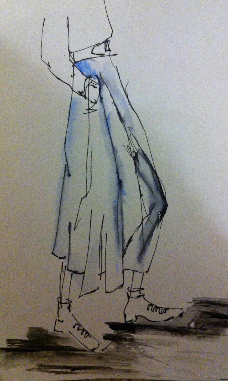
The above two, are inspired by Phillip Lims illustrations. I like the first one and feel that the sketchy style works well, and that I have portrayed Phillip Lims style well. 
However the second one, didn't work so well as it is not as free and loose.
For this illustration I used fine liner.


The above two are in the style of Antonio Marras, creative director of Kenzo. 
I really like this style, and feel that the illustrations work well, in reflecting my designs. 
For this I used my own fashion figure, but mixed it with the style of Marras by using fabric and machine stitch.
I found working in this style, easy as it flowed and felt natural. 
I will continue to work in this style, and carry on developing. For this illustration I used, paper, calico, letraset markers, machine stitch and fine liner.

Tuesday 18 December 2012

MAREN ESDAR

I have been researching into illustrator Maren Esdar, that uses computer collage. 
After sampling in my sketchbook, I have now tried to create my own.


This is my first, here I was experimenting with layering.
Again I am experimenting, and sampling.

Here is my final collage on photoshop. I have layered a Katharine Hamnett top "no more fashion victims" (this is something I came across in my sustainable brief) with a rabbit fur gilet. I have then inserted a picture of a skinned fox, as well as a face that symbolises both death and reflects back to animal rights with the ears.
I then carried on playing around, changing the colours of the face, and inserting an extra arm.


Friday 14 December 2012

GRAYSON PERRY

I have also looked at Grayson Perry, most famous for his vases. For his illustration I have used CAD - photoshop.


Grayson, draws illustrations and then scans them in to the computer and places them on streets with signs, which often have a link with an issue of the time or whats going on in the media. 

CHRISTOPHER KANE


Above I have began to adopt Kane's style, taking his original illustrations and experimenting to get a feel for his way of working and choice of media; pen, pencil.


Above, to the right bottom I have taken inspiration from his illustration, and interpreted it to reflect my own work. On his original the face appeared to be some sort of animal, so I did the same I took the nose and ears of a cow and mixed them up to make the face, and cow feet for the figure. These features are used to reflect leather and that it is not sustainable. I have then included a bow on the illustration as through my research I noted that when Kane was younger he would often fantasise about woman with bows, ball gowns  and long hair. I also included a top hat, as this is an accessory I used in my own designs, to reflect the sleekness and sharp tailoring of my sustainable designer Noir.
I think this illustration has worked well, I like the vagueness of it, and that it is left open to interpretation, it is not meant to be understood.

Opposite, I have directly re created one of Kane's work using pen and pencil.

I particularly like this style, its edgy and raw, I will take inspiration from this and apply it to my own current style.


PHILLIP LIM ILLUSTRATION

I have choose to experiment with Phillip Lims illustrations below, I have adapted to his style and choice of media (sharpie fine liner) as well as interpreting my sustainable designs to inform the garment choice.
This is a style of drawing I felt very comfortable with, I love the raw and "sketchyness" of it. I will defiantly be using this style to inspire and develop my own.


COLLEGE UPDATE

I have now started a new illustration brief in college, this is a skill I'm unconfident with and so will be good to improve my techniques!

One of the tasks is to research into both contemporary and historical illustrators, we then have to experiment with both there method and media. 

One of the illustrators I looked at was Carl Erickson, whilst researching I noted that he carried his sketchbook everywhere he went, and would only draw still life... so this is what I did.


I then took Eric's style and his preffered choice of media (charcoal) and began to sketch using my own capsule collection designs to inform the garments...


I like this technique and choice of media; charcoal. However I don't think this method would suit my sustainable designs as the illustration needs to be more current.


GOLDEN RATIO ON THE STAND

I had previously, modelled on the stand reflecting golden ratio. However I was dissatisfied with the work, as it appeared unfinished and didn't show my creativity.
Subject to this I have re worked the golden ratio, injecting more creativity. I am much happier with this work, and feel it reflects the golden ratio in a more artistic way.


Wednesday 12 December 2012

TROUSER UPDATE

Sunday 25 November 2012

MY TOP PICKS FOR THIS SEASONS ANKLE BOOTS


ALL SAINTS £175


ZARA £79.99


TOPSHOP £75


I LOVE THESE BOOTS!! AND ARE ACTUALLY ZARA KIDS BUT GO UPTO A SIZE 5, £49.99

Friday 23 November 2012

TREND BOARD - 2 

This is my second trend "Make love, not war" focusing on 60's fashion.


TREND BOARD - 1

Of of my tasks was to research into one of the current trends, for this I choose "its a beautiful future" looking at Peter Pilotto's SS13 collection depicting futuristic aspects.


Thursday 22 November 2012

TERENCE AND PAUL

Last Monday, I assisted stylist Martine Alexander working on a test shoot for Hair Studio Terence & Paul.

For this shoot, we went into Manchester store "Each to their own" and picked both male and female pieces by Alex Christopher, designs include individual cuts and shapes. 
We then went to Hale; Terence and Paul and began styling the models, in relation to the hair styling.

Here are just a few pictures, more to come...


Hair; Terence & Paul
Top & Dress; Alex Chrisopher


Hair; Terence & Paul
Jewellery; FatzK


Monday 19 November 2012

PETER PILOTTO SS13

Ok so LFW SS has long gone, but I'm still fixated on Peter Pilotto's collection. It combines, edgy heavy patterning, peplums and cut outs. 

Watch this space, to see my trend board...


MY FAVOURITE CELEBRITY STYLE INFLUENCE; OLIVIA PALERMO

MY CURRENT FAVOURITE CELEBRITY STYLE INFLUENCE IS OLVIA PALERMO, SHE IS SO EFFORTLESSLY CHIC!
SHE COMBINES SHARP PIECES AND KILLER HEALS TO CREATE A SOPHISTICATED POLISHED LOOK.


MY FAVOURITE A/W ITEM 


My favourite item for this season, is my Topshop Faux Fur Gilet I cant take it off! And for £55 its well worth the money!

You can wear it with just about anything, I find it works well with a blazer or leather jacket.


Friday 16 November 2012

MY TROUSERS SO FAR...

One of our tasks at College, is to design and manufacture a pair of innovative trousers that we will wear at Somerset House, London. 


Here is my final design that I choose on the left, inspired by shirt collar as is reflected on the waist, and cuffs as on the trousers.


I have now begun to toile, and pattern for my trousers.
I had to adapt the pattern to fit me, to do this I took 5cm from the bottom of the trousers, and took 2cm of each side of the centre from and back. I also added 4cm to the top of my pattern, as I want the trousers to be high waisted and sit on the hip.


SAMPLES OF DESIGN DETAILS

One of our tasks in college, in preparation for making our trousers was to sample design details. 

Thursday 15 November 2012


KATHERINE HAMNETT

“I decided I didn’t want to make a living from the people suffering at the bottom of the supply chain”

Hamnett is well known as a campaign for human rights and a political activist, using fashion and her launch of slogan t-shirts to express.
In 1989 Hamnett commissioned research on the environmental impact of the textile and clothing industry, which unearthed some appalling fact about deaths from contaminated water supplies, deaths from pesticides and poor working conditions in factories. This research ultimately made her pull out of the system and decided instead to go back to manufacturing in order to source and produce an environmentally friendly collection.
Hamnett worked directly with cotton produces, fabric weavers and garment manufactures, where she sourced organically grown cotton, trimmings and threads which enabled her to deal with all aspects of manufacture.
In 2006 Hamnett launched her online men’s and women’s wear collection under the label Katherine E Hamnett, E representing ethically and environmentally sound. The collection showcased both a wearable and durable collection.
Hamnett’s aim is to design clothes, which will be both long lasting and well made using high quality materials.

One of Hamnett’s most significant impacts was her collaboration with Tesco. She persuaded them to buy the cotton size months ahead of season and cut out wholesalers and agents. Hamnett during this project worked directly with fabric suppliers, this enabled her to produce fabrics such as a blend of organic cotton with 4% recycled polyester, this allows the fabric to be permanently pleated.

This is a campaign where Hamnett teamed up with online retailer Yooxygen to create statement “Save the Sea” 14 piece collection, combining one-piece swimsuits, bikini’s, cover-ups and beach totes.
The collection was made from sustainable fabrics, such as organic cotton, silk and recycled polyester. The garments where eco conscious however, still embraced 1950’s style silhouettes, and therefore didn’t loose there aesthetic qualities despite being organic.

GOLDEN RATIO ON THE STAND

At college, we investigated the golden ratio for those of you who don't know what it is, its the geometric proportion regarded as the key to creating aesthetically pleasing art. 

Here I created shapes on the mannequin relating to golden ratio.


Here I have displayed a use of repetition, line, asymmetrical, shoulder wedge and graduation.

DRAPING ON THE STAND

One of our tasks in college, was to use calico and drape on the stand creating shapes and silhouettes bearing in mind - Design Principles.


On the two above image I have demonstrated, repetition, line, symmetrical and graduation as the pleats get bigger towards the hem.


Here I have shown the use of repetition, line and symmetrical.


Here I have evidenced, shoulder wedge, asymmetrical, repetition and oversize.

Tuesday 16 October 2012

LIVERPOOL FASHION WEEK

This week, I am assisting styling on behalf of Next for Liverpool Fashion Week. 
Today we met one of Next's representatives from Head Office, to discuss looks and began to pick the clothing.

I also got to pick a garment from the collection, as a gift. Yayyy!


Some of the key pieces from the collection, are the geo prints. Identical to Prada!